With shield or on it.
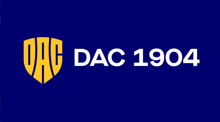
Introducing the new identity of the DAC 1904 club
What does the new logo mean?
The new logo is the symbol of our faith. We believe in the power of inherence and in the fight, what we do together for each other. Why do we have a new logo? Because it shows, who we are. It represents our values in every detail: the determination, the fight, the grit, and the inherence. The logo is the symbol of our faith and belief in the future.
Logo elements
The sun and the water,
these two ancient elements,
which form Rye island.
It is the fighter’s loyal partner
in the fight. It protects
and gives strength.
The three letters form unity,
as our community does.
We honor our past and know,
who we are.

WHY DO WE HAVE A NEW LOGO?
Because it points to who we are. Each element represents our values: determination, militancy and belonging.
The logo is a symbol of our belief in a common future. Watch the behind the scene video.
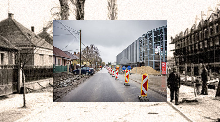
A bit of history
Logo evolution
DSE, 1908
Hivatalos pecsét,
1908
SLAVOJ, 1953
JEDNOTA, 1965
DAC TE, 1970’
FC DAC, 1990’
FK DAC, 2000
FC DAC, 2014
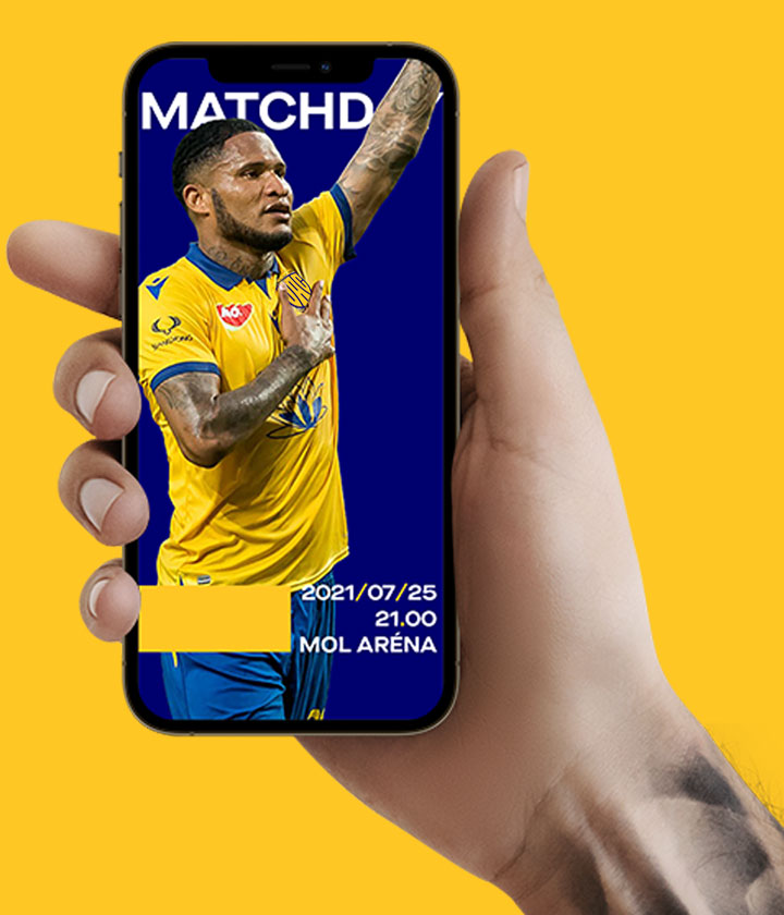
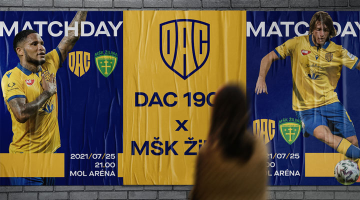
DAC 1904, 2021
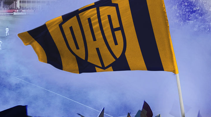
WITH SHIELD OR ON IT
When the Spartan mothers carried their sons to fight, they said goodbye to them with the following words: “Come home on the shield or with it!” It means, that either they return home victoriously, or they die with dignity. Victory or hero’s death – there was no other option. This is, how we fight, too, and this is, what the shield reminds us on every day.
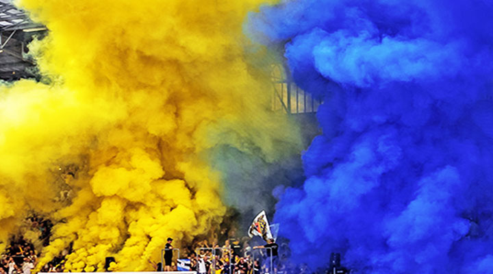
DETERMINATION – TOGETHER IN THE FIGHT
We are not afraid of anybody, and we look towards the future with raised head. We become better every day, and we are stronger with every action. We march together on the way of victory and glory.
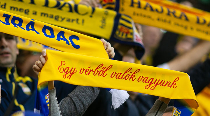
PRIDE – DAC FOREVER
117 years obligate. We must carry on with building condignly, what the ancestors began. DAC is our life. We are proud, that we can serve this club, jitter for this club and fight for this club.
INNOVATION - WE NEVER STOP
We built a new academy to teach and educate the future generations. We created a modern stadium, where we can enjoy the pleasure of football together. Our modernistic training center provides an international level background for our footballers. The next element of our growth and evolution is the renascence of our logo from the season 2021/22.
FREQUENTLY
ASKED
QUESTIONS
The new symbol of DAC is the next element of the evolution, it is another step on the way of renascence. This is how we show to the world, that we are an innovative, modern football club, with strong identity.
The shape of the shield symbolizes the power of strength and inherence. With the new logo we show that we are tough fighters, who are characterized with team spirit and willingness to fight.
Our new symbol is traditional and modern at the same time. It reminds us, with the respect to our traditions, to the old logos of DAC, but besides this, it is clear-out, simple and modern. With the new logo we show that the three letters of our club transmit strength and determination.
The new logo is the result of complex work, which lasted many months. The creator is the designer team of the Milanese advertising agency Interbrand, which – among others – created also the new logo of Juventus in 2017. The creators paid attention not just to present trends, but also the history of DAC and the values of Rye island during their work.